SASid Brand Standards
Color Contrast
It is important to provide sufficient contrast to create readable text when developing content. While most color combinations usability seems obvious at a glance, we do our best to check Web Accessibily Standards to make sure that people with varying levels of blindness, low vision, color‑blindness can equally use our content.
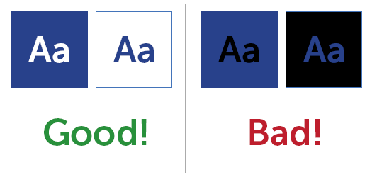
The following Color swatches are marked with a white icon and a black icon. A check mark denotes acceptable color contrast and and ‘X’ denotes insufficient contrast.
So in the example above white text on top of the SASid blue, but black does not. This applies in reverse as well. So SASid Blue text works on a white background, but not on a black one.
Note: there are exceptions. Larger or bolder text can get more leniency, and buttons often exceptions as well. Contact Blake or check the colors here if you are unsure.
Company Colors



Product/Services Colors








Website Colors




NAR Product Colors









Application Color Palette (Legacy)
These are the default color variables for SASId Inc Applications
Primary Colors
The four main colors will be primarily used throughout the layout and content of applications, websites, and software. They will help to establish key features like titles and icons and organize the content into a hierarchy of information.
Secondary Colors
Primary Colors The four main colors will be primarily used throughout the layout and content of applications, websites, and software. They will help to establish key features like titles and icons and organize the content into a hierarchy of information.
Tertiary Colors
Tertiary Colors These four colors are used in program elements like tooltips, confirmations, warnings, and calls to action. They will be seen mostly in buttons, popups, warnings, errors, etc.
Multi-Product Quoter 2.0
New and Shiny. In the works.
Backgrounds for Layering
Accent Color Themes
Colors for Variation & Attention-Getting Elements
Typography
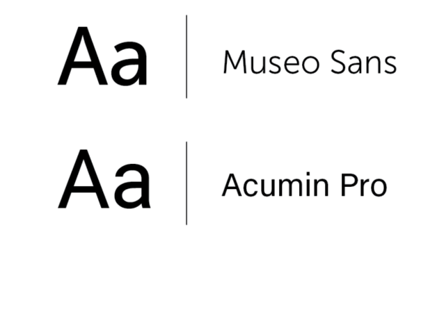
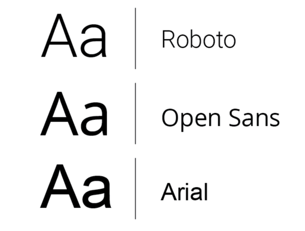
Typography is a key element to consider when maintaining a brand. SASid’s mantra of course is to keep things simple. Therefore, using San Serif Fonts are the natural choice to convey these sensibilities. A few suggestions below:
Size 14 type is the minimum web size for readabilty and a good rule of thumb.
Preferred Typefaces:
Acceptable Alternatives
Icon Style
Icons can convey a lot of information in a small amount of space. The SASid brand tends to use line-based Icons with rounded endpoints.
Border Styles and Graphical Details
Photography and Background Imagery
Used at a case-by-case basis. Photos can help add a personal touch to the user experience.
Photos and images NEVER can be simply copied from google images or other sites. Please ensure images used are properly licensed. If you are looking for an image for something, browse through images here and contact the SASid Graphic’s Dept. for purchase.


Composition & Creating Clear Hierarchy
It is important to take proactive steps in guiding the user through your experience. Thoughtful use of basic design principles can make a huge difference in readability.
Try to use a single dominent Image or Large text so you can ensure that is the first Element the User will See.
Ways to Order Your Hiearchy:
Element Size.
Element Color or Background Color.
Element Location.
Element Familiarity.
Element Repetition or grouping.
Do’s And Dont’s
A few helpful tips in creating readable and clean user experiences:
Don’t Use Harsh Gradients
They are obnoxious and outdated. Just Don’t.
Do Give Text Room To Breath
Consider padding and margins. Try to put text closer together with other text that relates to it.
Don’t Use Too Many Type Styles Or Color Variations
Too Busy!
See the SASid Graphics Dept. for More Direction
Creating clean visual design can be tricky. There isn’t always one correct answer and weighing pros and cons of design decisions can be time-consuming. Fortunately I can help, don’t be a stranger!